Aurora Design System
20 November 2021
💡 This post is an in-depth look at how we created the Aurora design system at Kepler. If you'd rather view this as a presentation, please click here for the Figma prototype.
❓ The problem
Consolidating our approach to building user interfaces
Up until roughly early 2020, the tools, guidelines, and resources available to developers at Kepler to build products (particularly front-end web apps) were fairly limited.
We used semantic-ui-react for most of our components, along with the default theme packaged with the library. Most of these components were left as is, while some components had their colors changed to match one of four colors that formed Kepler’s limited color palette at the time. This meant that most of our user interfaces were one-off projects –– with little consistency in terms of UI patterns, and custom styling set up for the various components that were used to build each self-contained app.
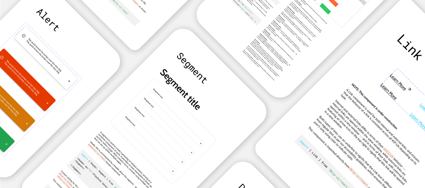
For example, we used three different variants of an Alert component across multiple user interfaces –– each with their own style and placement within each app, and no particular rationale for these differences, making for a jarring user experience.
While we used the same font (Lato) across our apps –– again, down to using semantic-ui-react –– we lacked a consistent type system, with custom-sized headings and text existing across various user interfaces. We also had no established best practices or guidelines to aid with consistency in terms of how color was used, or on how to make our apps more accessible.
As we continued to scale as a company and as a team, more products were being built at Kepler –– and with it, our growing number of UIs were gradually becoming more inconsistent when put side by side. A number of our UIs are also part of the same workflow for users, which in turn made this lack of visual consistency more discernible and discordant.
Overall, this meant that finding a way to maintain design integrity and creating a simple, systemic approach to being able to ensure visual consistency across all our apps became more crucial.
Project Goal
Our goal to solve the issues outlined above was straightforward –– create a pragmatic design system for Kepler, with implementability and usability being the primary concerns that we used to inform our decisions.
Implementability and usability were crucial, given we had a number of user interfaces in production. This meant that as we added components to our design system, we also had the nontrivial task of updating components across all our apps, and ensuring that this task was as painless as possible.
And finally, we wanted to build a design system that, in effect, could be considered a product in and of itself; continually serving the rest of our products at Kepler. We wanted to ensure that creating our design system would not be viewed as a one-and-done project, and by thinking of our design system as a product, any updates were considered an interation, a step, in a larger continual process of building out our design system.
✨ Results
Our final results involved a number of deliverables that together form the Aurora design system. These constituents can be broken down into three broad categories:
- A specification; viz., a style guide.
- Components and mockups designed in Figma, which allow us to clearly visualize what an implementation of our specification might look like.
- The implementation, viz., components built in React and Typescript, exposed to our developers through an installable library.
Specification
An audit of existing systems
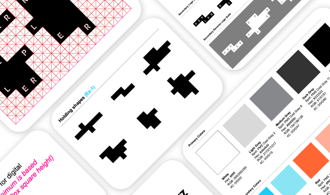
Our first step was to take stock of what we had so far. As mentioned earlier, Kepler’s color palette was fairly limited –– we had the choice of using four colors:
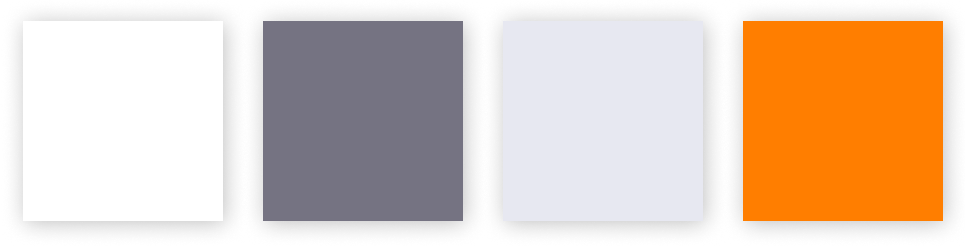
- white (#ffffff)
- dark grey (#757382)
- light grey (#e7e8f1)
- Kepler orange (#ff7e00)
These colors were set up in the early years of the company, and there were no real guidelines pertaining to how these colors were to be used outside of how they were used with the old Kepler logo.
Additionally, given we'd already built out a number of user interfaces — we also looked into our own UIs to examine whether we were potentially using any UI patterns, and then evaluated whether they were worth continuing to use, or whether they were worth updating.
Research
Our next step was to dig into existing open-source examples of design systems to figure out what made sense for us to set up as part of our design system. This entailed answering a wide range of questions. What sort of documentation do we need for each component? What states or variations were worth setting up based on what we use in our existing UIs?
During this process, certain open-source design systems stood out as extremely complete and thorough, and we inevitably found ourselves looking at these examples for inspiration when we needed it. A few worth mentioning that we owe a lot to –– Shopify's Polaris, Artsy's Palette, Vercel's design system, and Ethereum's style guide.
We decided it was important to start with the style guide, our specification, given all of our implementation would follow from this particular element of our design system. The contents of a style guide form the fundamental building blocks of a design system, and contains documentation and guidelines around colors, typography, form design, accessibility, iconography, and more.
In addition to this, we wanted to put together guidelines and documentation for our primary users — the developers on our team. This included best practices and guidelines they could refer to as our team built out components and other UIs, and contribution guidelines for developers who wanted to contribute to our growing design system. We also set up design principles to inform all of our decisions, and a tone of voice document to standardize how we communicate with our users through our products.
Mockups
Figma allowed us to set up our components in a way where the various stakeholders on this project –– from product managers to engineers to senior management –– were able to see what a components library built on top of a cohesive style guide could look like.
This also meant that we were able to give stakeholders a sneak peak of what this could mean for our UIs. Once we'd designed a majority of our components in Figma, we were able to use these components to mock up new versions of popularly-used UIs at Kepler. This further helped clarify the true potential of setting up a design system, and generated more buy-in for the project.
Implementation
This was easily the most exciting part of this project for me. While this might be heavily biased, I strongly believe that a design system with no components in code is essentially a heap of documentation.
As mentioned earlier, the main concern here was ensuring that every component we built could be as seamlessly integrated into our existing apps as possible. Put simply, there was no point in creating a newly styled component if updating all of our existing systems with this new component was an extremely laborious task –– given this could then entail redoing substantial portions of each app.
With this in mind, there were four broad approaches to setting up our new components:
1. Restyle existing components in the semantic-ui-react library
This approach allowed us to just restyle an existing component while leaving most of the implementation intact. The setup within semantic-ui-react allows us to manipulate the style of each component using less or css (or both) –– with each component having two files that essentially set up the style for that component.
2. Adding functionality or sub-components to existing semantic-ui-react components
In many cases, we wanted to either add more functionality or sub-components (for example, a title for an input or dropdown) –– and in these cases we wrapped the existing component, and set up custom styling for that wrapped component. This was useful for situations where it was clear that the default semantic-ui-react components did not give us all the features or styles we were hoping for, and ensured that we weren't losing any functionality while replacing an old compoennt with a new component.
3. Restyling third-party library components
In other cases, semantic-ui-react simply did not give us any options for a component that we needed. For example, the library does not contain a date picker or file uploader component. In these cases, we created a component that wrapped a third-party library that we found to best serve our needs, and restyled the component to fit our style guide.
This sometimes meant that we were in for more work when we got around to updating our UIs, given these were scenarios where we were potentially forced to redo the internal logic of each application to satisfy the needs of each third-party library. However, given we were switching out various one-off instances of these components created within each UI (sometimes dependent on the same library, meaning there was unquestionably duplicated code that we were simplifying), the extra work was worth it.
4. Building custom components from scratch
And finally, there were cases where we had to build a component from scratch because there were no third party libraries or components that fit the bill for what we needed –– particularly for Kepler-specific components. We tried to keep these to a minimum given they inevitably take more time to code up, but were possibly the most fun to set up given these were the only components where we were essentially working with a blank slate.
Impact
The payoff of taking the time to set up our design system was felt immediately across both our engineering and product teams, but for our users as well.
Onboarding the product team onto Figma has allowed us to shift from creating mockups in Powerpoint and move towards building hi-fi mockups that use a constrained set of components and guildeines that match what is available in code via our components library.
Our components library has also saved countless hours of engineering and product time previously spent playing around with colors, component states, and font sizes as user interfaces were being developed; given the lack of a clear spec to build a user interface from.
And finally, our users have reported the slow and steady move towards a more unified experience across our products have made them easier and more enjoyable to use.
🎤 Conclusion
To summarize:
- Our approach to user interfaces and front end development was inconsistent, which was becoming more apparent as we continued to build more products at Kepler.
- After spending time examining our problem and brainstorming potential solutions, we determined that creating a pragmatic design system for Kepler that focused on implementability and usability would solve our problem.
- Our final results have shown that with our new design system, Aurora, we're now able to build user interfaces that visually consistent and part of a broader product suite, look and feel better, and are easier to use and develop.
As mentioned earlier, one of our guiding principles with this project from the start has been thinking of our our design system as a product, with none of its constituents considered set in stone. While we know it is inevitable that Aurora will be updated sooner or later, and will require a certain amount of TLC -- we're excited to see how our initial specification develops, grows, and changes over time based on our exisiting implementation, as our components are used in existing and new user interfaces built at Kepler.